When I started my position as a Web & Digital Media Assistant, the first thing I begun work on was sketching up a new layout for their website. At this time, a new website design identity was being laid out by UW-Milwaukee and University Housing wanted their new one to follow the campus' new approach while standing out and be unique to their department.
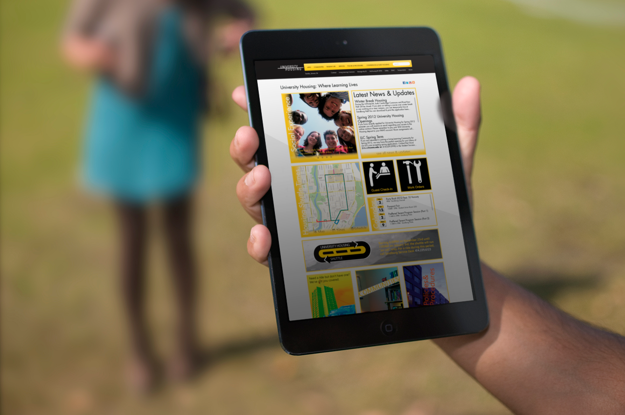
Proposed University Housing Main Page
After numerous hours of discussions, mockups, and wireframes on Illustrator, this was the proposed design for the new home page to University Housing; A complete redesign that put an emphasis on interaction for both traditional desktops & laptops along with newer touchscreen devices.
What made this site follow the new web identity to UWM while standing out was the header which went with a black background like prior designs rather than the white background that the school's overall site was going with. The Footer was also a major departure as housing wanted a full list of links present along with social media links.
Content Rotator (Left), Housing Updates (Right)
Housing Shuttle Widget (Left), Guest Check-In & Work Order Buttons (Top Right), Events (Bottom Right)
While the bottom half focused on links to other important pages, the top half is what stood out the most. These widgets were the result of going out and asking those that compose housing. From students that lived in the halls, to the RA's that manned the buildings, and even security & maintenance for University Housing was approached and asked what they would like to see in a redesign of the website. This collective of information is what provoked the radical shift forward in the website proposal.
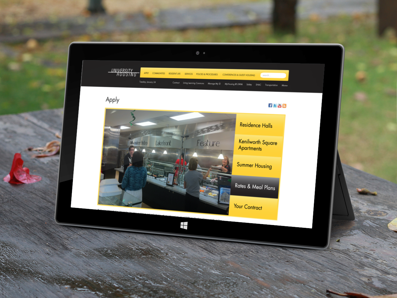
Apply Page - Univeristy Housing
Many of the pages though would be redesigned to move visitors to the content and information that they were seeking out. The Apply page would be one of those, where information would be routed through a content rotator that can be managed and updated as needed.
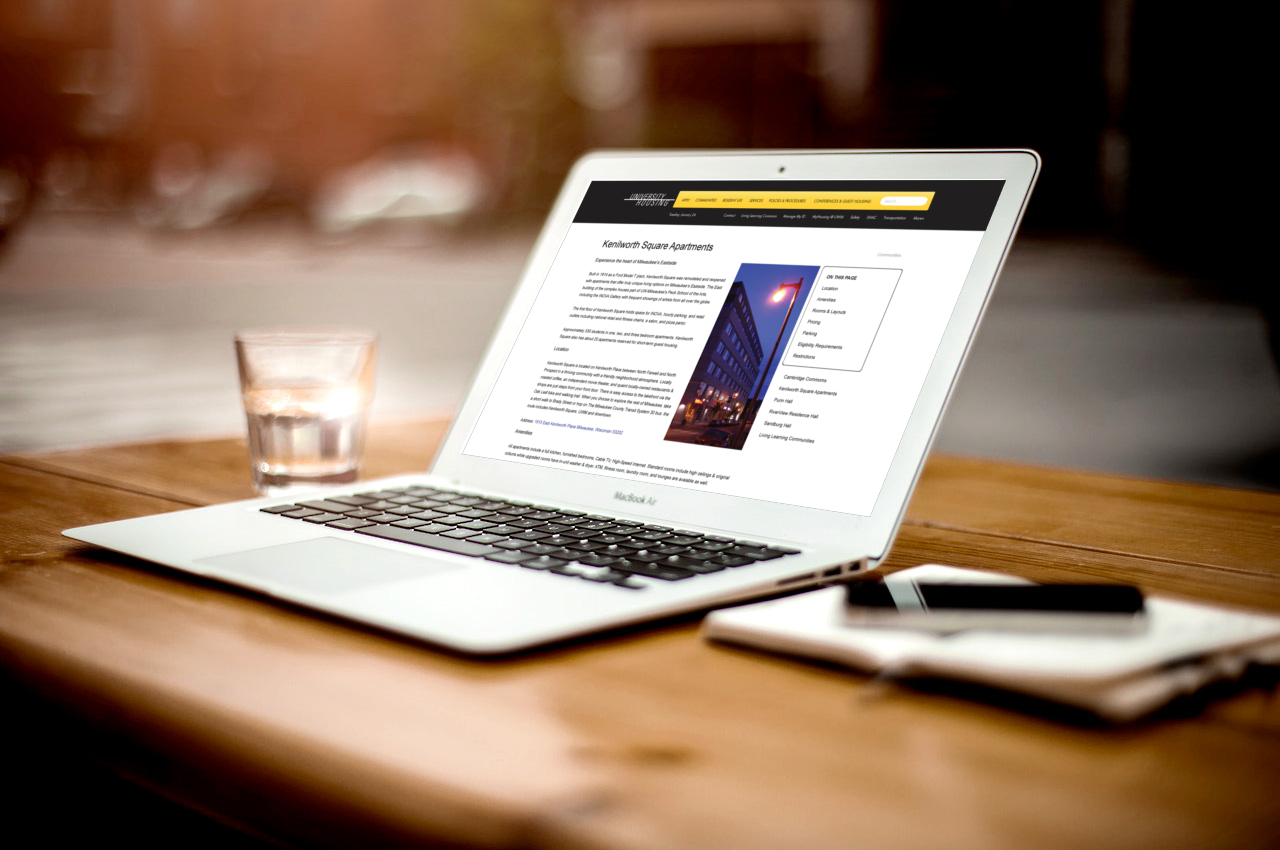
Kenilworth Square Apartments - University Housing
The redesign proposal also gave the individual residence halls and apartment buildings run by University Housing a refreshed approach to information for both site visitors and potential residents. In the case for Kenilworth Square Apartments, this single page layout outlined information that would otherwise be on multiple pages.


Although this proposal was applauded in-house, delays for starting the building and development of this site redesign kept occurring while eventual budget cuts across the entire school system would only seal its fate and soon my own position. Nonetheless, this was a watershed moment of a project. Rather than slamming together something and calling it done, I went beyond what was expected by interacting with those made University Housing possible. It was what content they wanted to see and what they would use to see that content is what made creating this proposal stand out, even if cancellation was the end to the site redesign.