Near the end of my time working at Univerisity Housing, an update to the some of the page banners in their website was in dire need. On top that, I was experimenting with a more inviting and vibrant approach to the presentation of their logo. From the beginning, I was wanting to show something that expressed growth as living on a univeristy campus does grow and evolve a person. Using a blossoming flower to symbolize this was the direction I went with. But page banners was only part of the output for the Housing Flower concept.
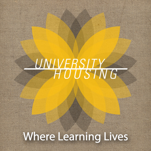
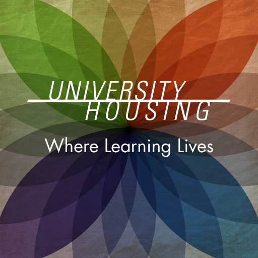
(left) Housing Flower using UW-Milwaukee colors, (right) Housing Flower using Residence Hall colors
Combination of the existing logo for University Housing with a unique color to identify with each of their residence halls. Arranging them together in such a way that they blended together and interacted from overlapping with each other became a defining feature of this logo.
Housing Flower final design
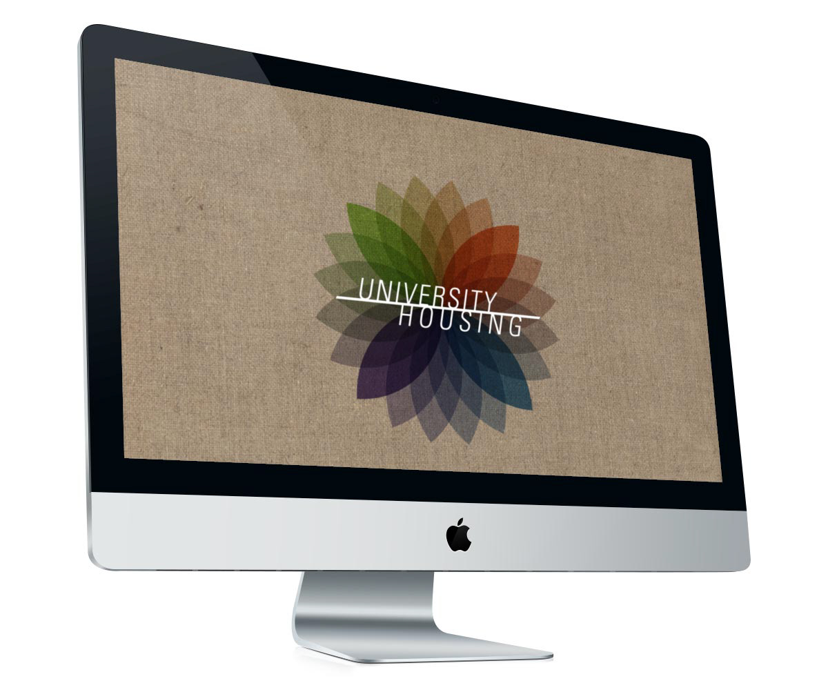
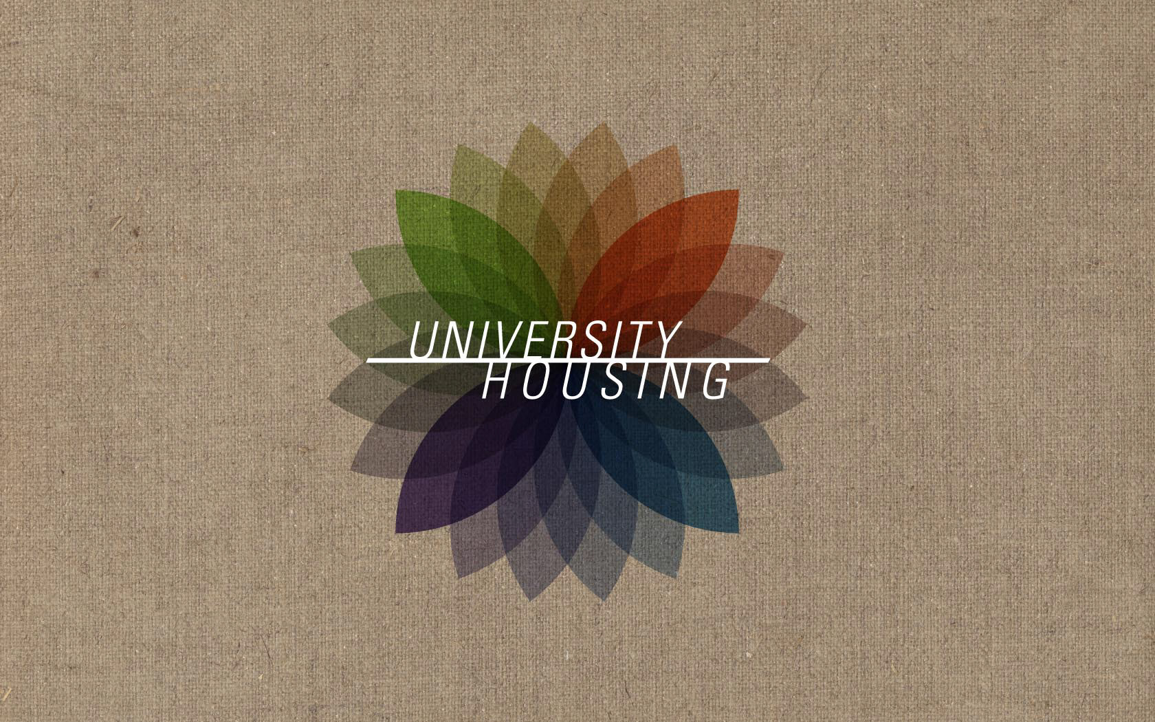
Housing Flower as desktop background
Using this as a desktop background for kiosks and work computers in housing was an envisioned idea of mine. The pairing of the colors and canvas background was a jump from using the traditional black & gold combination. But with summer in mind, a vibrant flower bearing the logo would be more fitting instead of a stark black background with a white logo.


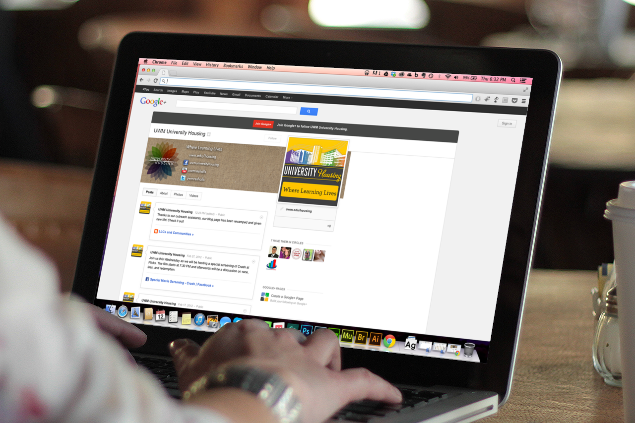
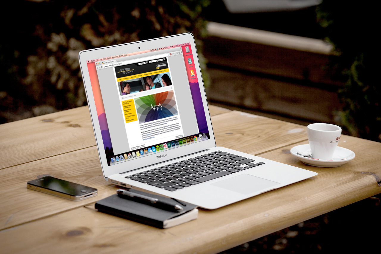
(top left) Facebook page using Housing Flower for the banner, (top right) University Housing Twitter theme using Housing Flower design, (bottom left) Housing Flower on Google+ page, (bottom right) Housing Flower adapted for usage in department website
For the next couple of months, the Housing Flower was present on the Facebook and Twitter pages to University Housing alongside with the start of a Google+ page.
The only usage of the Housing Flower concept that was continued with were the page banners put up in late May 2012 until a complete redesign of the of the site was applied in the following years.