In early January 2012, I was visiting a friend of mine in Los Angeles. On one of my last days there, I ventured across town the Tesla Los Angeles showroom where a beta version of the upcoming Model S sedan was on display. After spending time there seeing and learning about the technology behind the all-electric sedan, I knew that this was the future. It screamed to me, "This is the technology of tomorrow! You and everyone you know will soon be using these!" This would not be the first time I had such a revelation as a decade before when Hewlett Packard's Jordana 548 yelled to me the exact same notion.
That following semester during my Web Design II class, I had to make something that was based off a series of readings that we had to go through and type a report about our opinions on them. A glaring, if not offensive, statement from one of the essays stated that nothing screams, "This is the future!" So when we had to create a web-based project that was inspired by the readings we just finished, I decided to build a mobile app prototype for an all-electric vehicle.


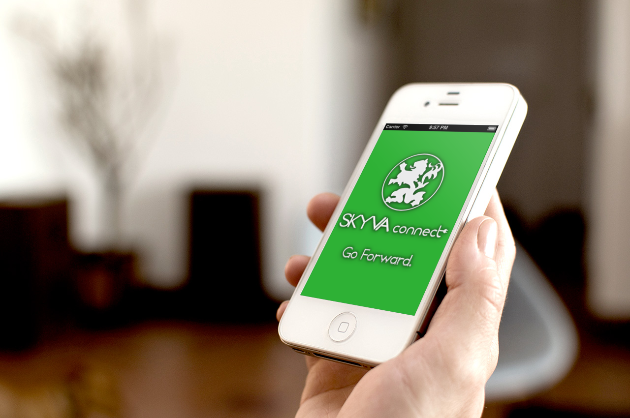
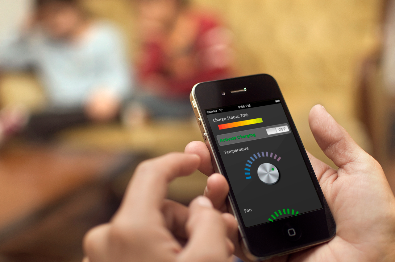
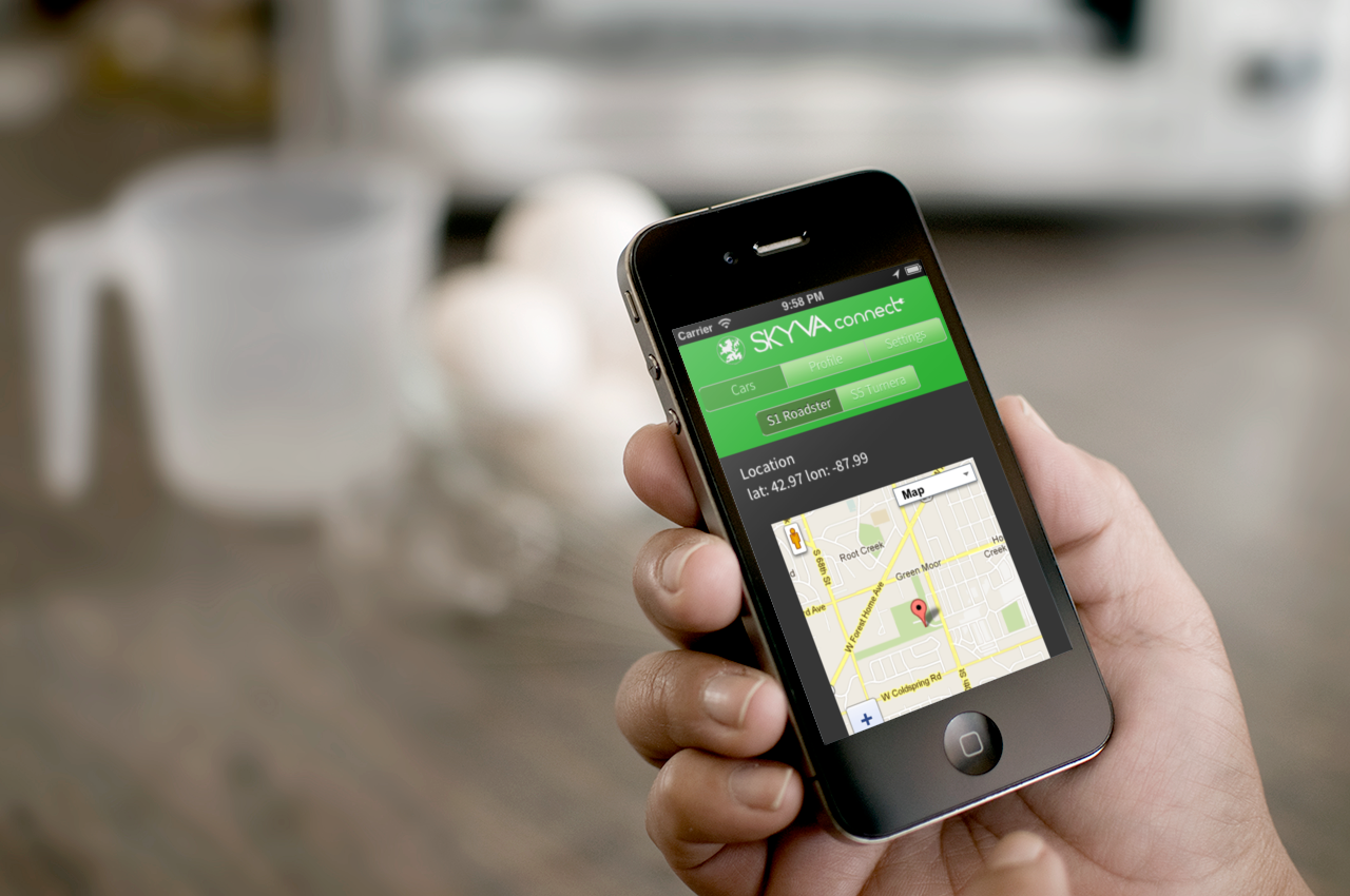
(left) Welcome Screen, (center) Charging Status & Cabin Temperature, (right) Vehicle Location
Rather than building this app prototype with an existing car company, I decided to imagine my own. I went this route rather than making one "meant for all electric vehicles" because I knew that a universal app to connect to any electric car may sound aspirational, but was by no means realistic at all.
The functions illustrated in the app were some simple and essential aspects of an electric vehicle. Checking the battery level of the car, or adjusting the temperature of the cabin were put in place. The addition of the vehicle location was also considered to be important if in a dense and unfamilar city.
Although this was a “non-functional" mobile app in the sense that it did not interact with an electric car, the user interface was completely functional. From the switch to allow charging, turning the dial for the fan speed, or changing the temperature of the cabin the user interface was completely laid out and operational. But what also made this prototype impressive was the map, which was not a static image. Instead, the map displayed was pulled from geolocation features in the mobile browser and displayed on google maps within the app itself. Making this put my skills in UI and experimentation to great use and even though this project wrapped up two years ago, a revised version with more interactive features and a new design have been considered.