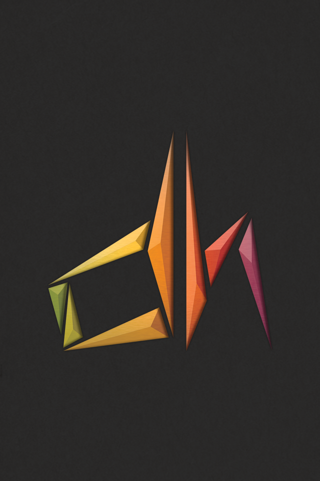
For some time I knew that I needed a logo for myself that I could settle with. During the summer of 2012, I begun sketching out ideas for such a thing. After numerous sketches, I moved towards an angular design that I soon moved forward with.

(left) 2012 Logo Design Concept, (right) 2013 Final Design
By September of that year, I had a concept design that I was excited to work with and expand as I approached graduation in the coming months. But I knew that alterations would need to be made before a final decision.
By early 2013, I had input and opinions made on it by friends and fellow designers. With alterations to the "D" that made it more grounded and aligned to the corresponding "H" I had finally come to a personal logo design that I could work with and stand behind. While replacing the gem-like forms with clean and flat triangles and a single-color background, I still wanted to retain the entire color palette from the concept as opposed to just choosing a couple and discarding the rest.
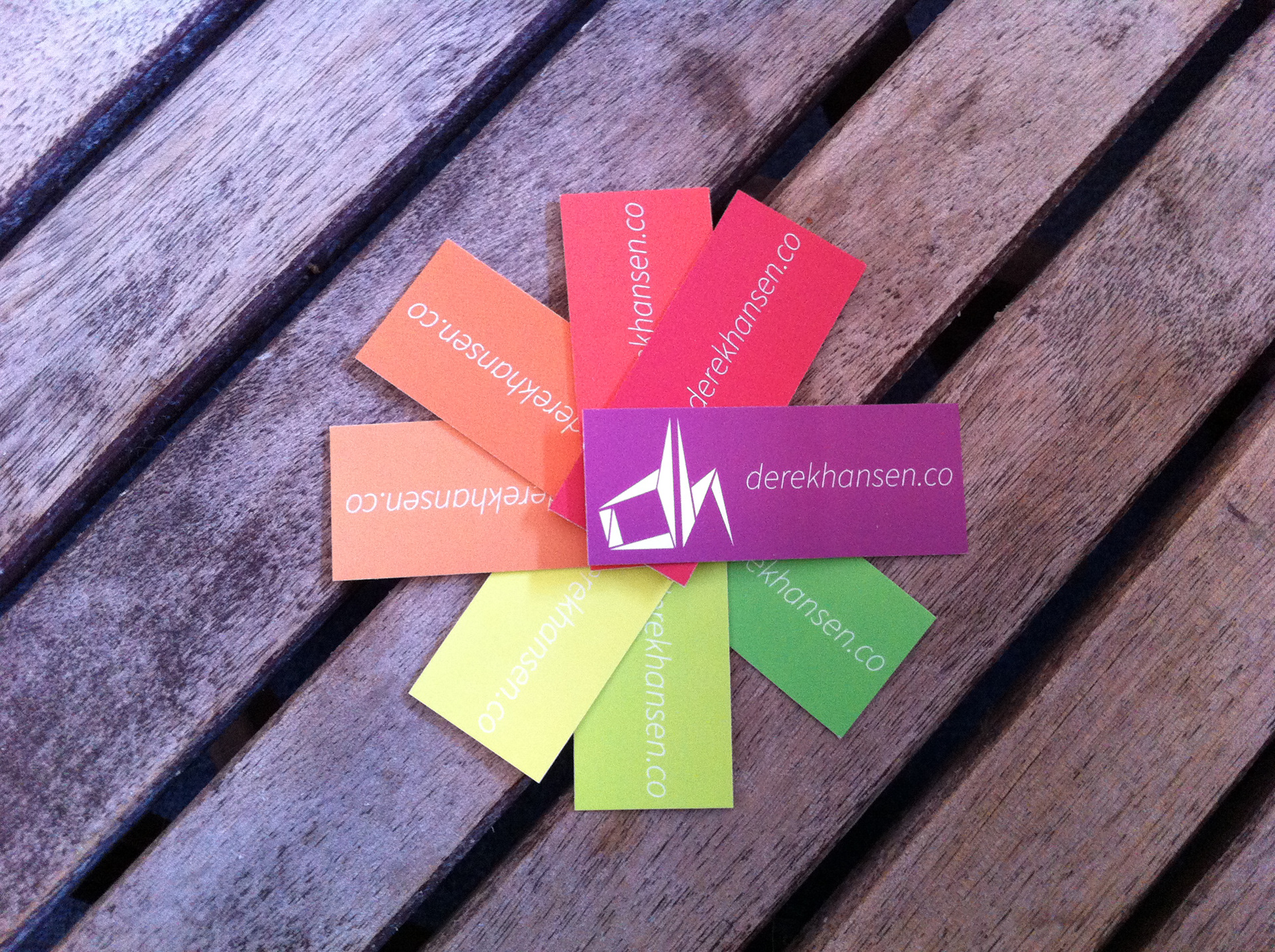
Business cards bearing the finalized logo and using the color palette from the concept logo
The first batch of business cards were the first display of the new logo and color palette. Taking a cue from Pantone swatches, each of the eight colors are able to be expressed individually rather than competing with each other. This style actually made selecting which color to choose for some to be exciting from the variety.