ASQ, a non-profit based in Milwaukee, brought me in under contract to work on and improve their email design and deployment. Throughout my tenure with the organization, I brought forth my prior experience in HTML & Silverpop to produce refined HTML templates, and develop new ones with visual improvements and a mobile-first approach while adhering to brand guidelines.
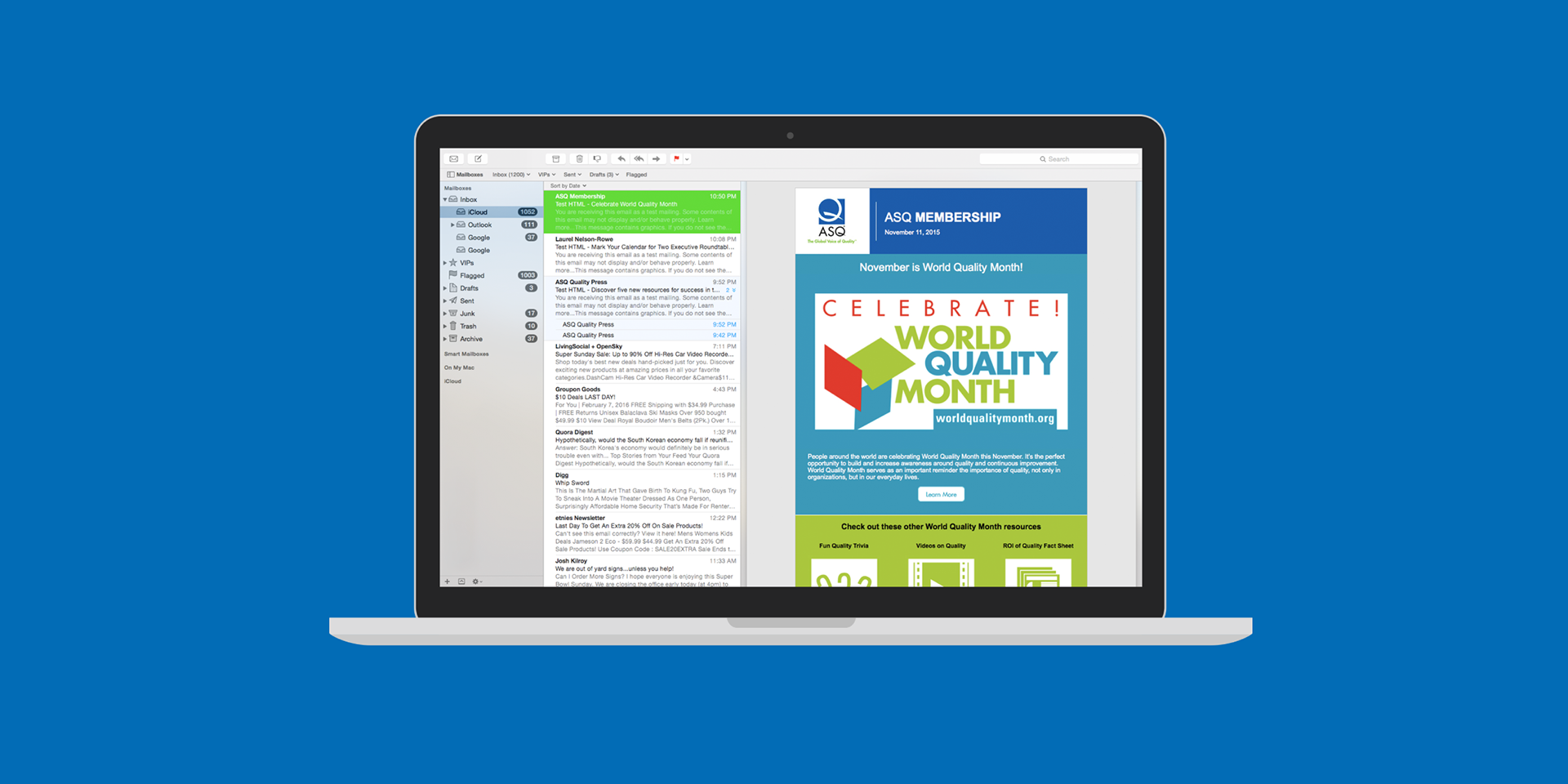
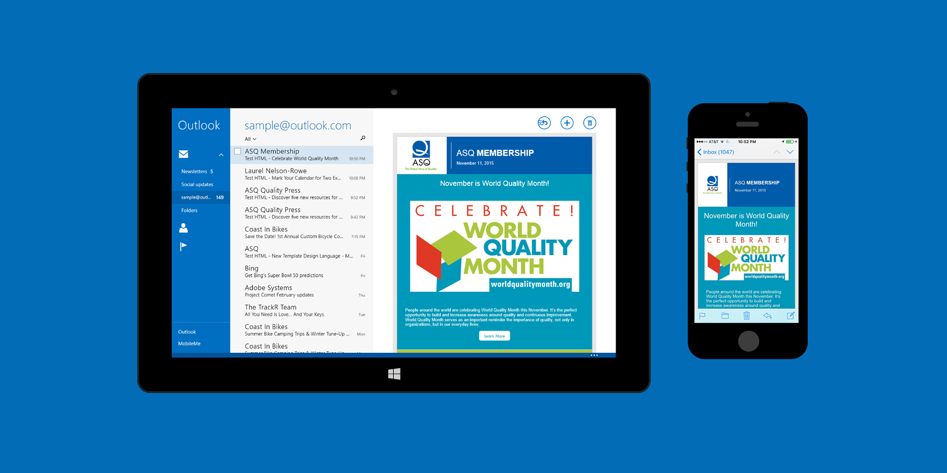
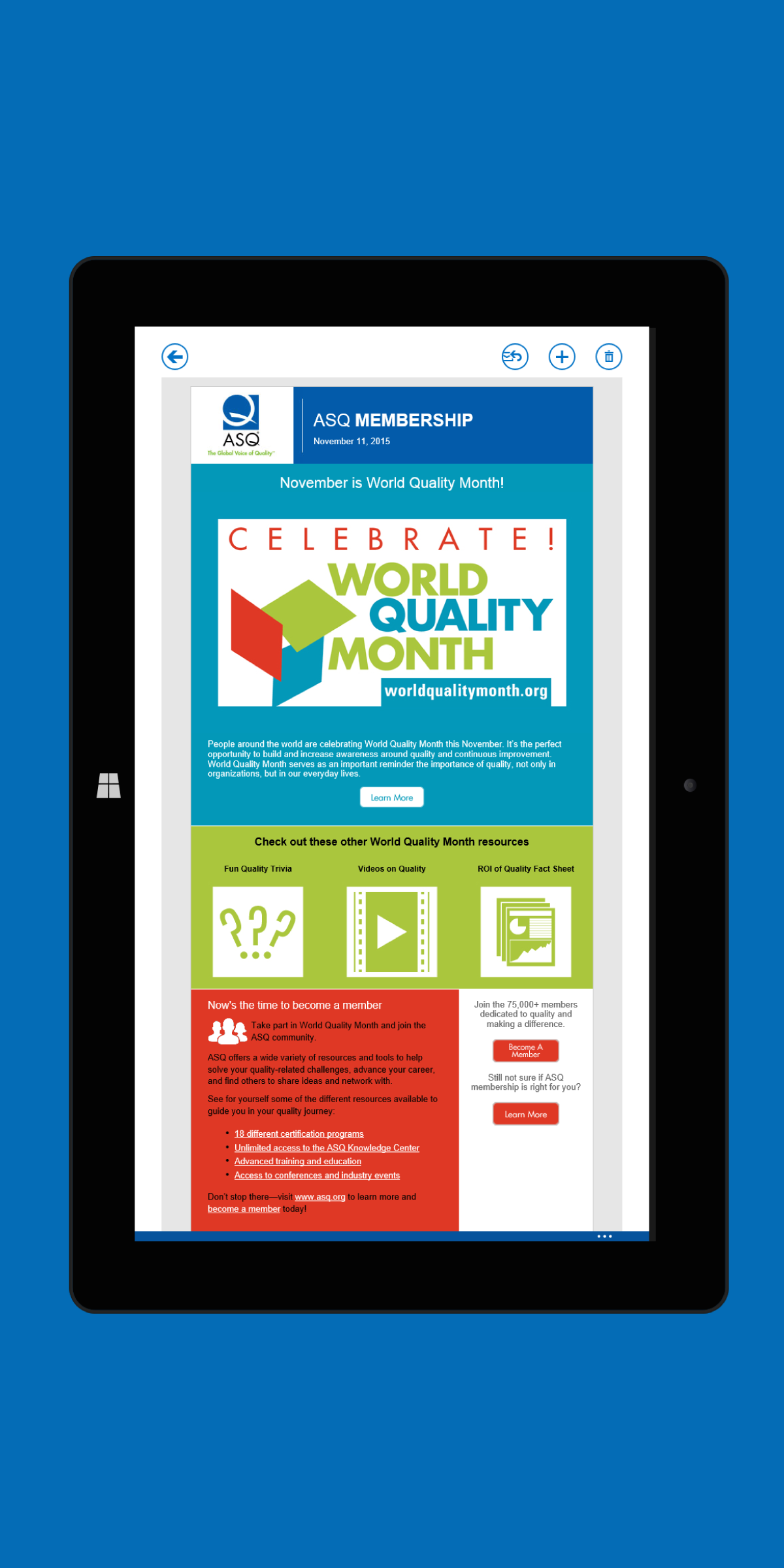
When the content and brief to the World Quality Month email came to my desk, I saw an opportunity for us to stand out from other emails that were produced. The resulting product was a clean and organized newsletter with easily identified content using links and images that were quick to identify. Along with the custom graphics I made, one significant aspect was applying recently redesigned link image "buttons" I made with Adobe Illustrator specifically for the email. Images were used instead HTML link buttons to ensure greater email compatibility at the time.
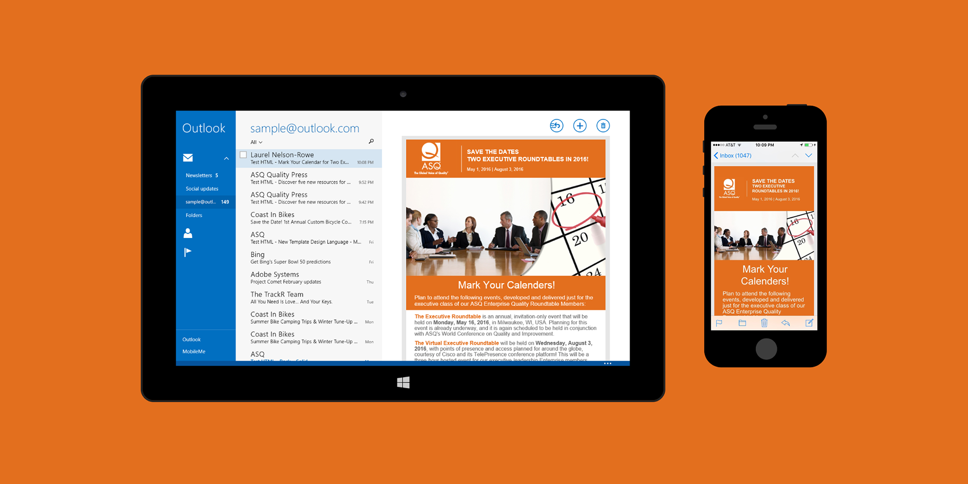
Moving forward, changes to the templates themselves were implemented. The header background was made a single color related to the email category with the logo & text standing out in white. Text blocks alternated between white and the category's color to break apart content.


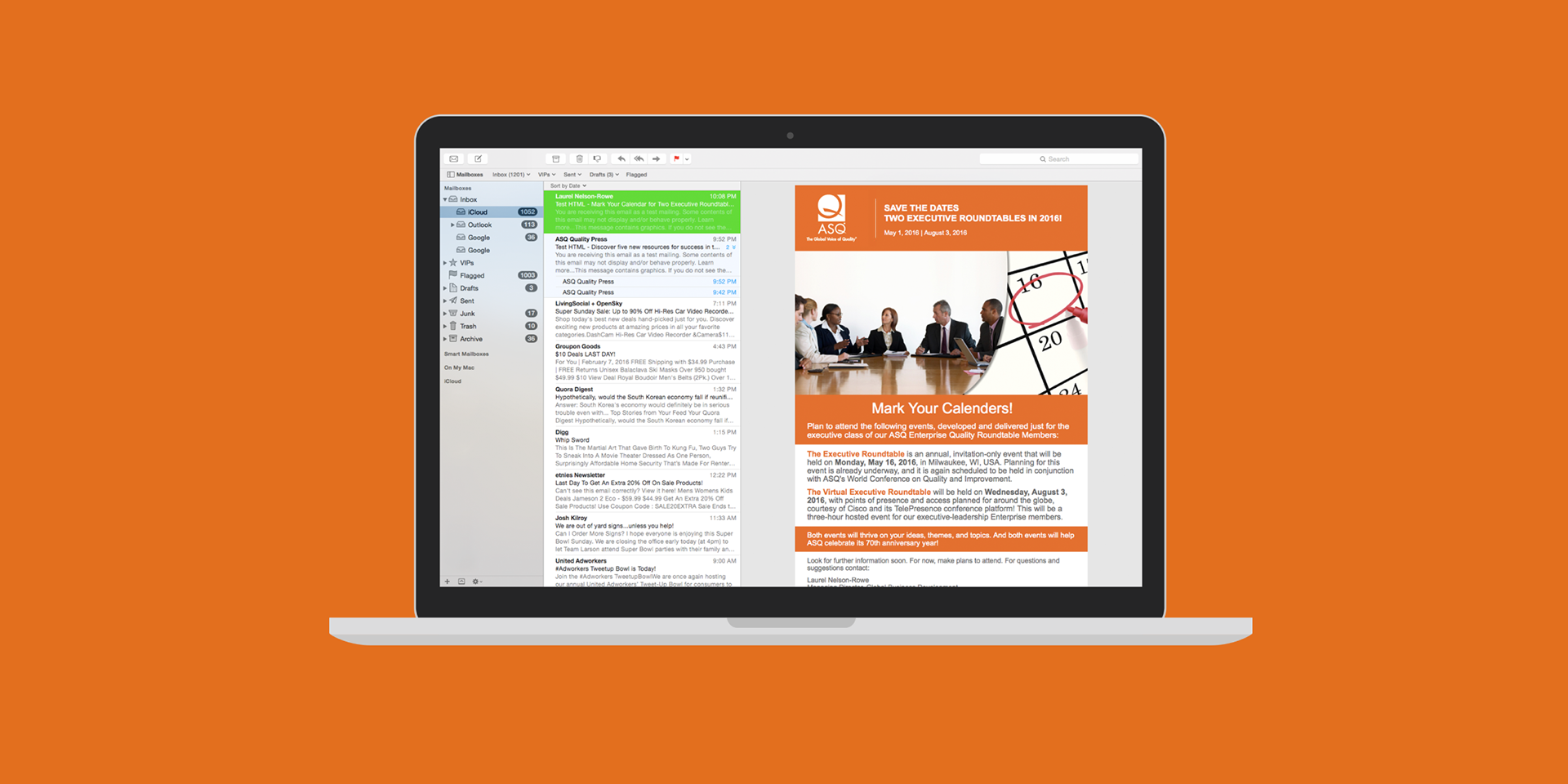
Continuing the changes in design, this specific one used an animated hero image that blended the header and text together.
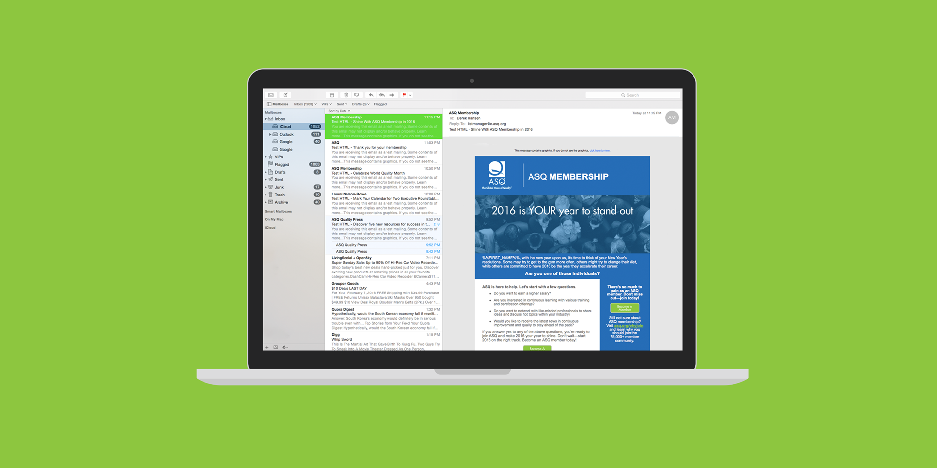
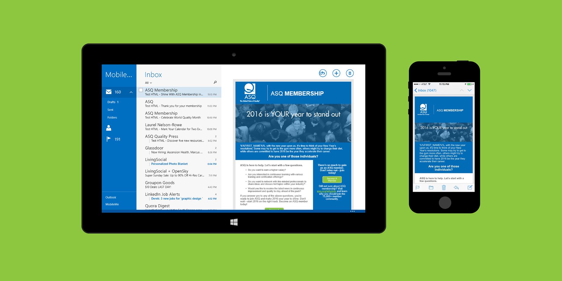
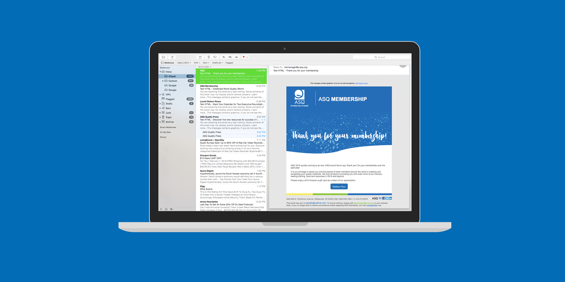
Hero images themselves soon got a new direction using Adobe Illustrator to create and export images that both added text and overlaid the category's color onto the image. This approach proved to be more efficient in turnaround time than a HTML-driven solution that ran into multiple compatibility issues.
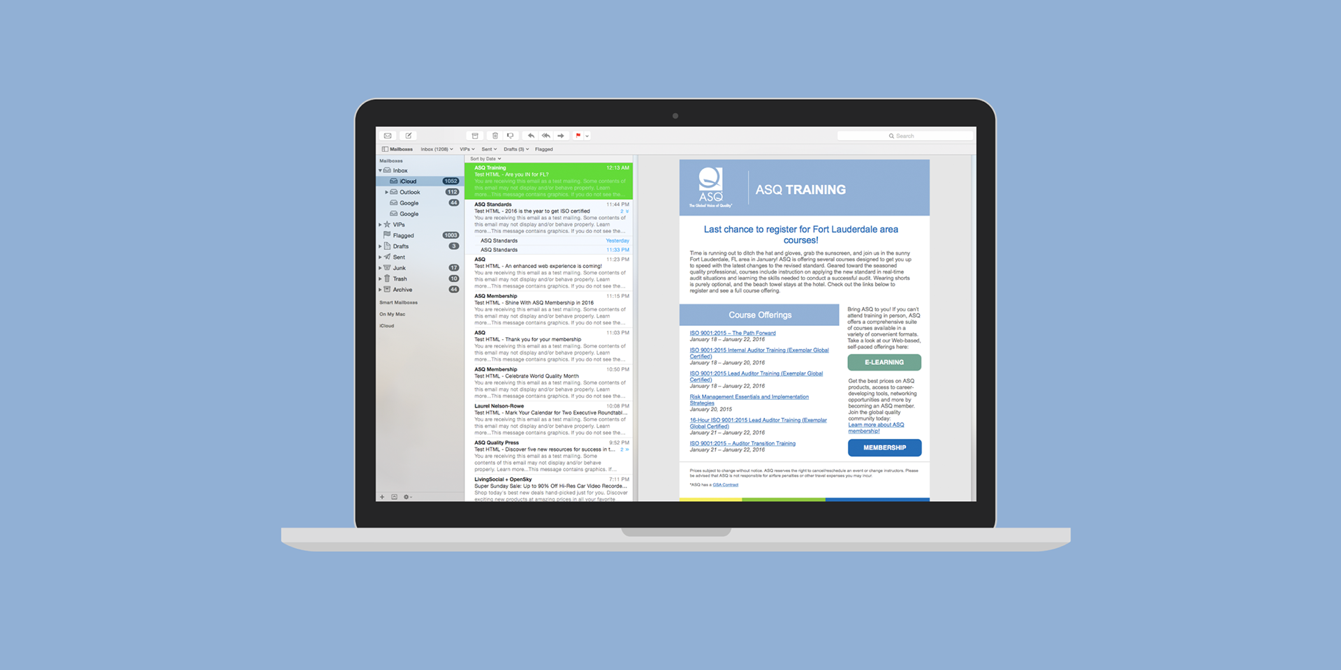
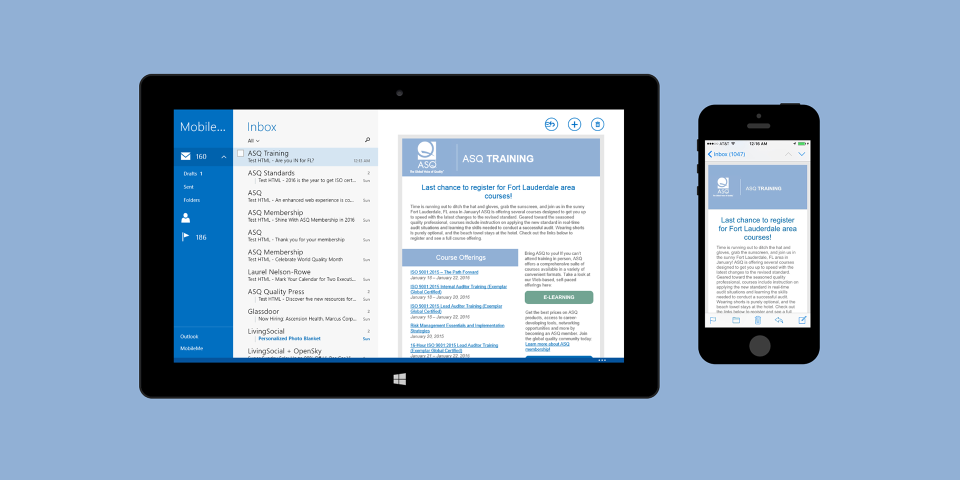
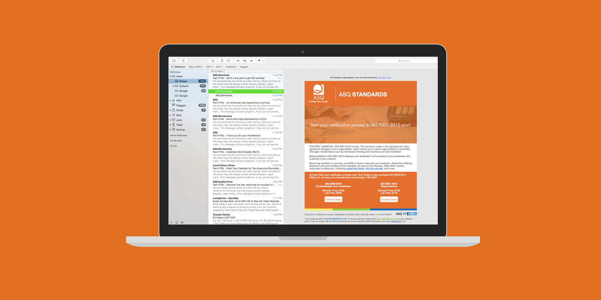
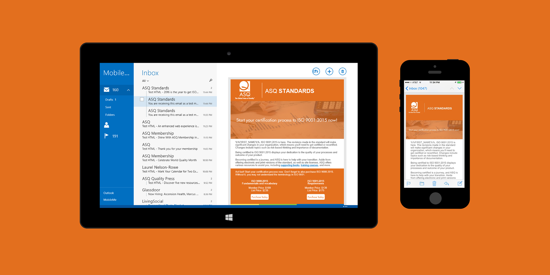
HTML Email buttons soon found their place with ASQ Training emails. Located on the sidebar, these proved to be compatiable after numerous tests and debugging to produce.
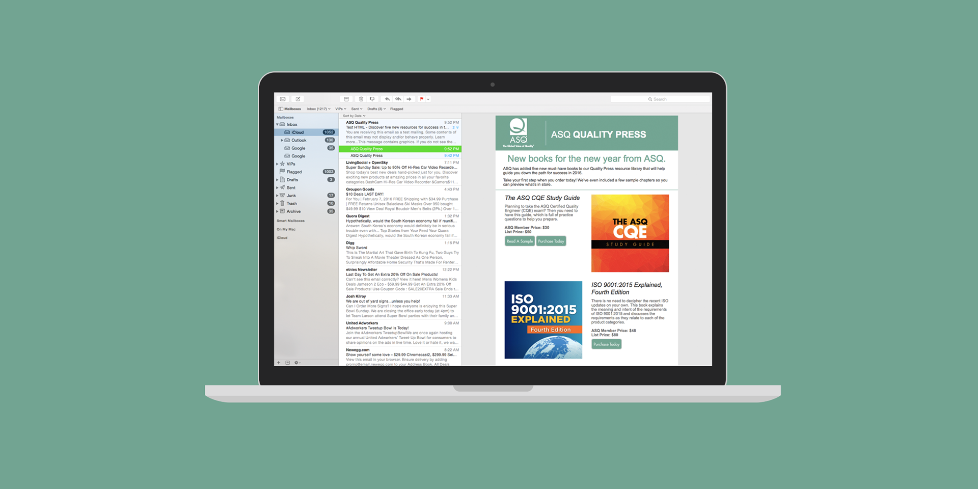
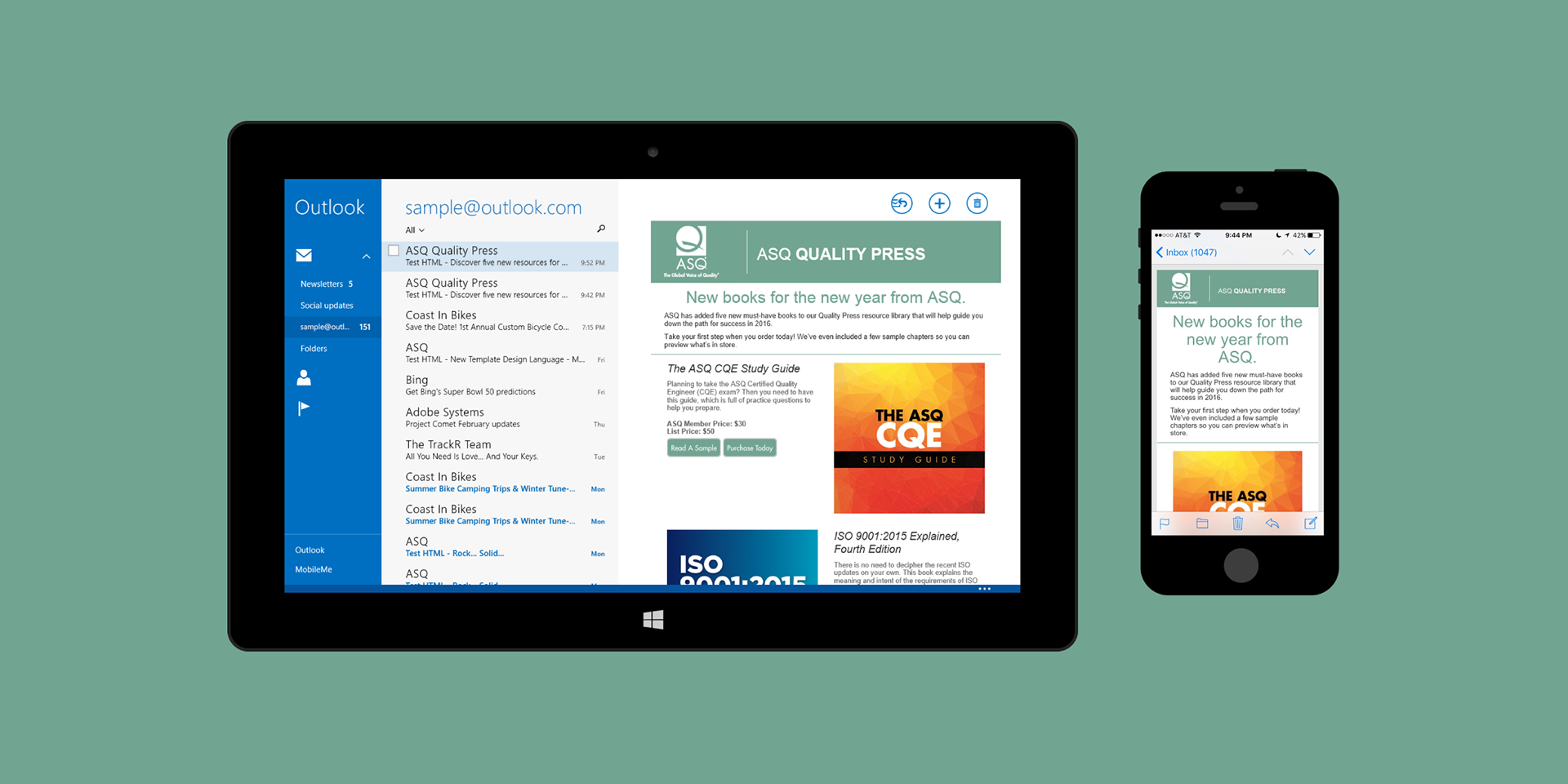
Consistent innovation in email design required experimentation. This email for publications was a prime example. Taking advantage of the dir HTML attribute to keep images apart on desktop, but inline and in order on mobile, allowed the best viewing experience possible for recipients regardless of the kind of device used.
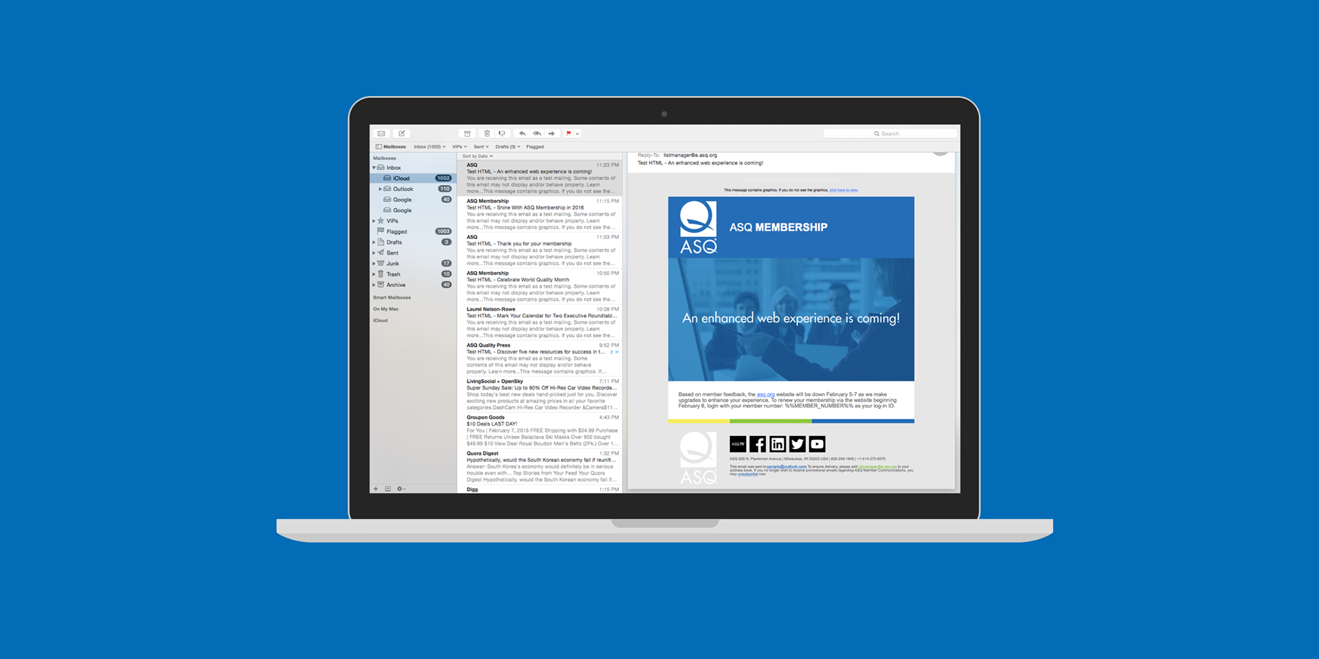
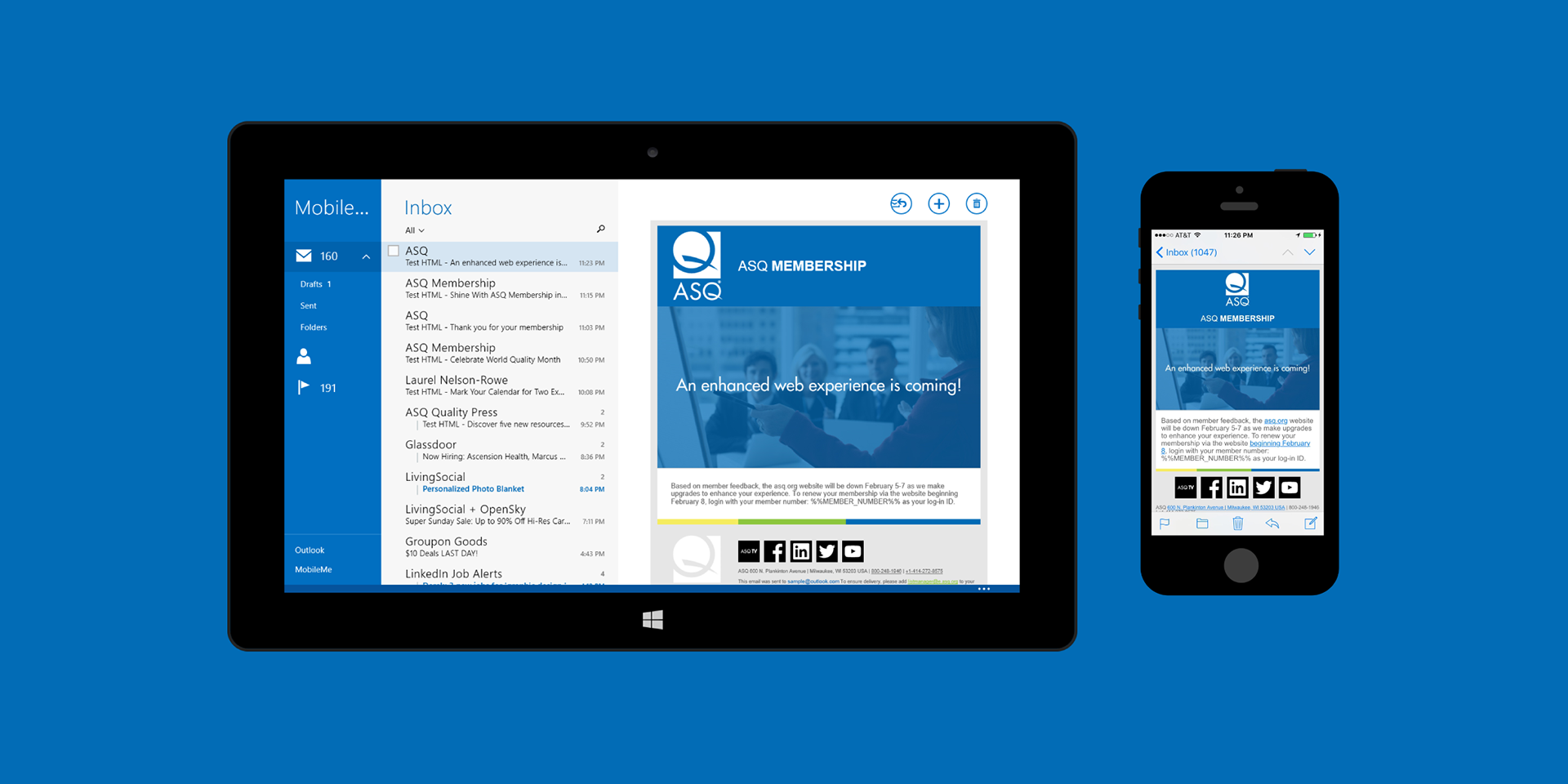
One of the last emails I worked on rolled-out even more features in a new template. Now with the ASQ logo taking a more prominent space in the header & footer, along with custom made social media icons that included one for ASQ TV, this specific template combined nearly everything that evolved from earlier emails. One mobile-specific feature was how the ASQ logo was handed. On the header, the logo would be placed above all other content. Meanwhile, the one located at the footer would go hidden to give more room for the social media icons.
With my contract completed at ASQ in February of 2016, I walked out of the office into the chilly Wisconsin winter air knowing that I made a contribution towards making an impact on improving their templates and how email overall is to be handled and viewed.