During the spring 2011 semester at UW-Milwaukee, with my capstone project on the horizon starting later that year, I knew that I needed to create something that encapsulated what was learned from both my art & design classes and from my art history classes throughout my time in a university environment. On top of that, I also sought out to make something was relevant to both my style and strengths. With this in mind, by mid-April I had settled with a project that met these requirements.
Codenamed “Sencha" this project would pair together a capstone project for my Bachelor’s of Fine Arts with a research paper for my Art History degree. The BFA section would be a series of illustrations based on the WPA posters generated as a result of the New Deal Act of 1933 while the Art History section would go into detail on some of those artists that designed and printed the actual posters from that era. Although the Art History section would be cancelled, the BFA section would move forward in the summer with studies into the approach and execution to the making of the WPA posters. From this background work, I was able to hit the ground running on day one the following semester in the autumn.
My most significant class to the success of this project came from taking Digital Printmaking 2. This gave me access to various experimental and practical methods in printmaking, leading up to the development and printing of the final work for the show in December. Along with this variety of projects came a multitude of different students in fine arts and graphic design that provided input and critique towards the final eight posters.
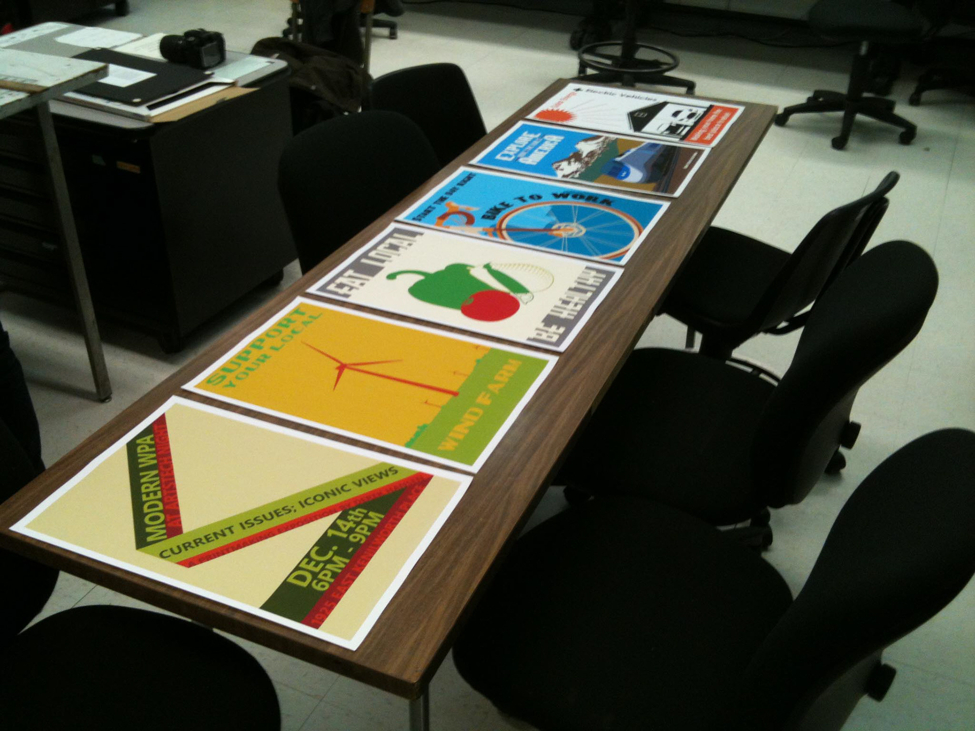
Scaled prints for critique
Prior to printing the large 18×27 inch prints, each of the posters were printed on 13×19 inch matte paper to both present and determine any needed changes. The changes that were made got applied to the final template that measured out at 117×40 inches and was printed on a large format printer. The decision to make the final prints through that process was made for multiple reasons. One significant reason is that using a large format printer would be the most readily accessible method of printing. Silkscreen and lithographic printing methods were widely used for the WPA Posters of the 1930s as those were the most accessible methods of that time. Although there were a variety of different printing methods done in my Digital Printmaking class, lithography was in a separate class while a silkscreen printing project had too many conflicts in timing for the December 11th show.
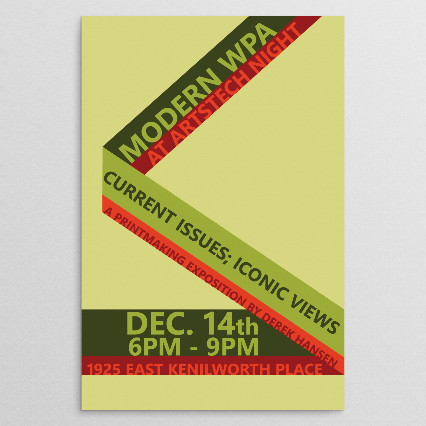
Promotional poster for December 2011 event
By October 16th, the final name to Sencha was revealed. With the December event titled as Modern WPA At ArtsTech Night: Current Issues; Iconic Views - A Printmaking Exposition by Derek Hansen, the official name for the project would bear the name Modern WPA.
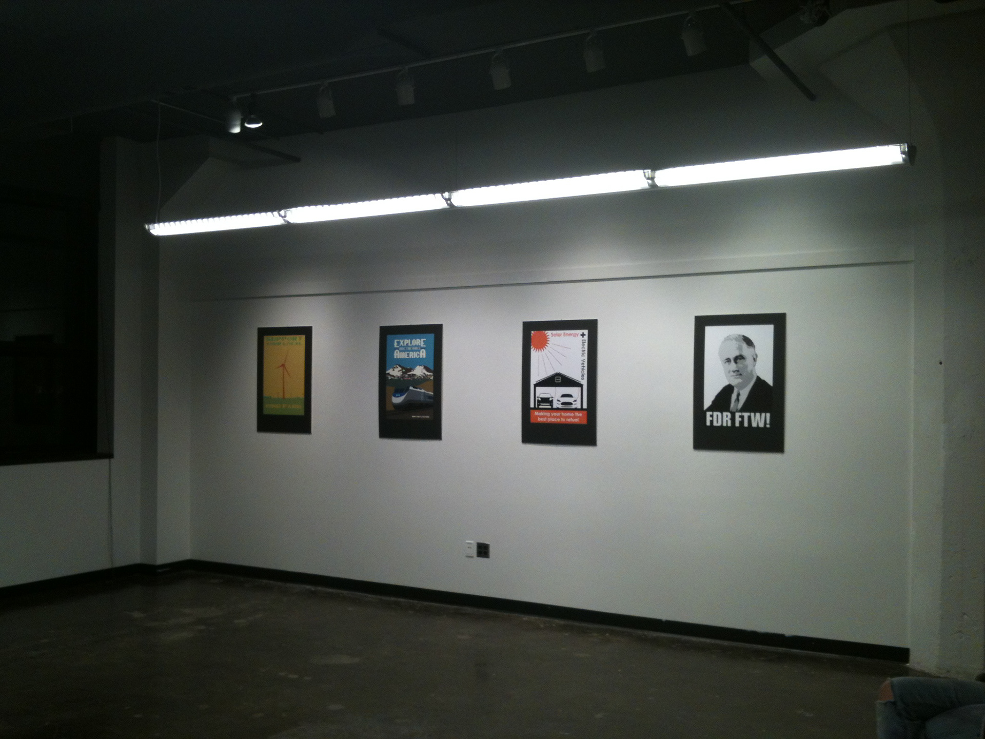
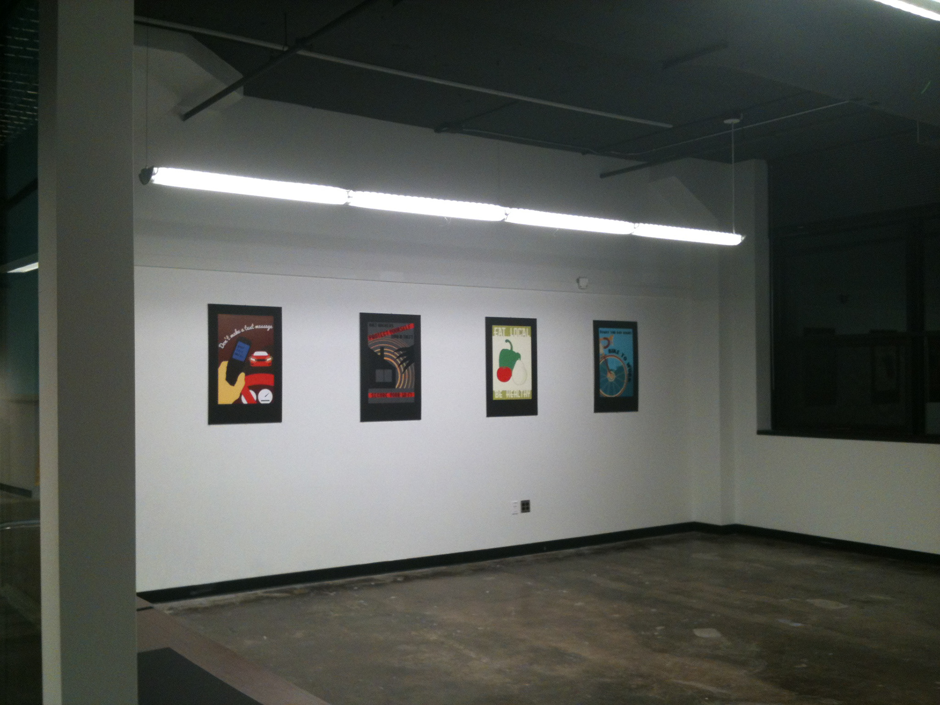
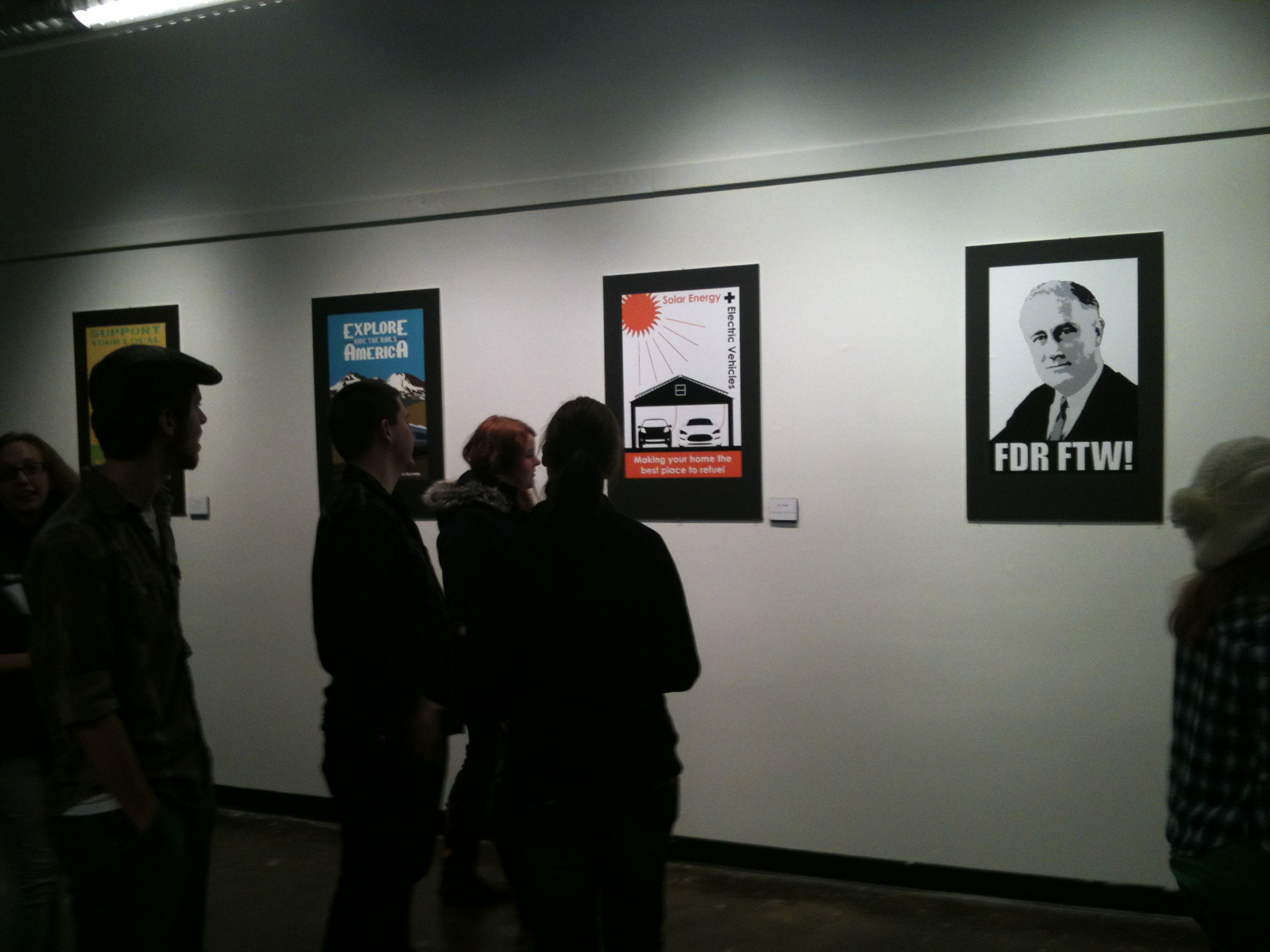
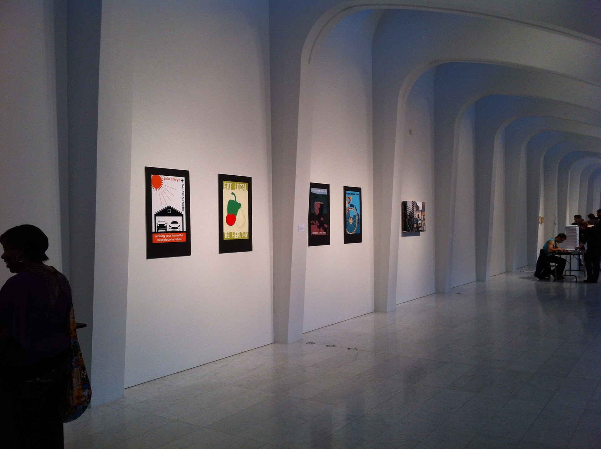
(From left to right) South Wall, Room 363 to Kenilworth Square East, North Wall, Room 363 to Kenilworth Square East, Modern WPA at ArtsTech Night - December 11th 2011
Once the prints were finished being matted and picked up, all eight were precisely spaced out and placed with help from a friend and fellow art student in time for the showing on the evening of December 14th.
At the show, those that walked into the gallery were greeted by both myself and a setting that was different from anything else on display that night. The lighting was dimmer and had a more relaxed tone inside. Questions were answered about how they were made and what went into the process when asked. Some stayed for a couple of moments and carried on while others took their time gazing at the posters. The response was very positive from viewers and really liked the idea of taking a vintage style and applying it to things that are more current. After the showing, the prints were on display for the rest of the week for private showings before being taken down on the morning of December 17th.
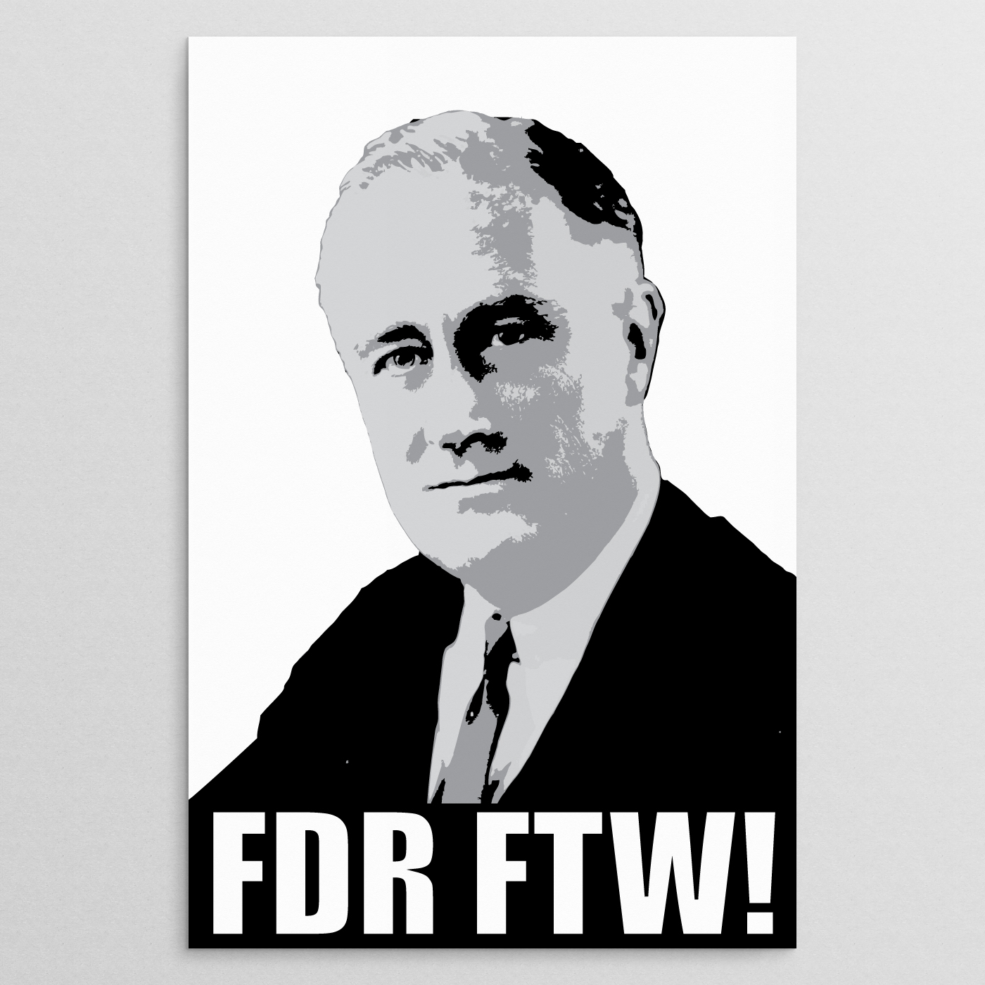
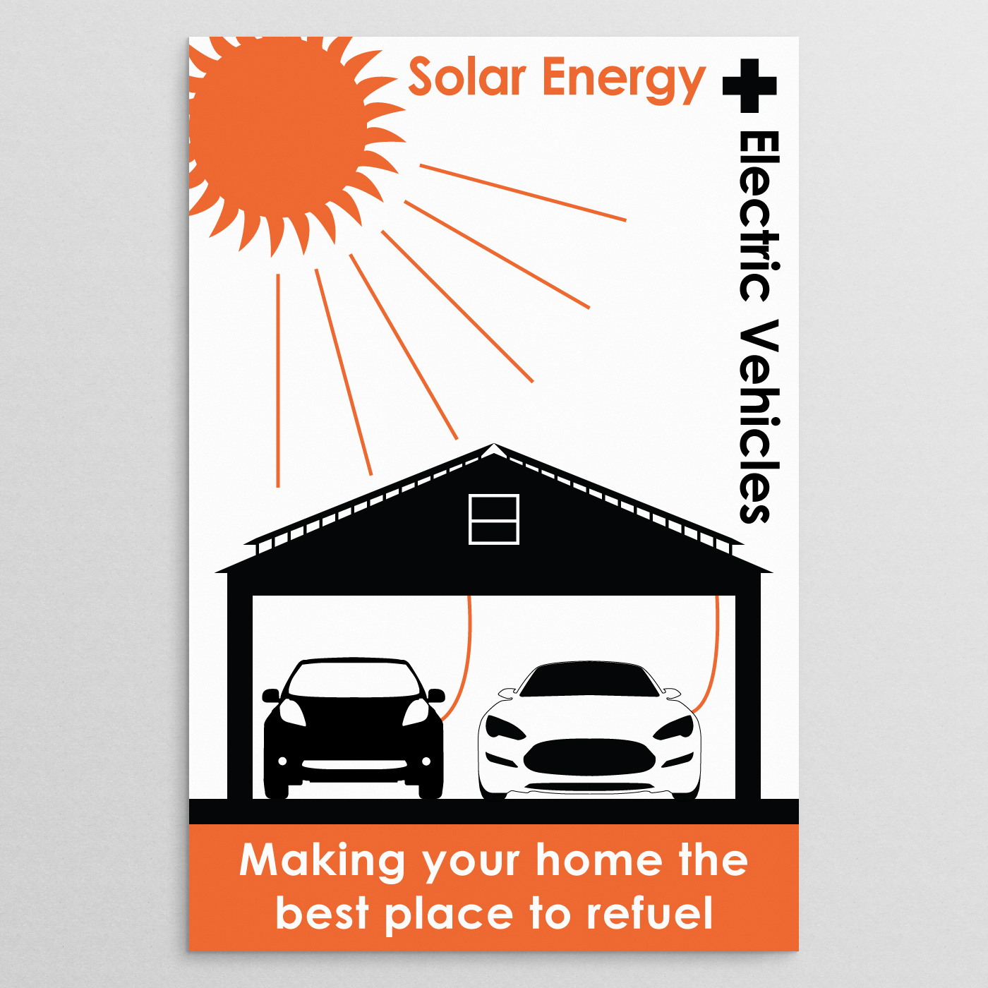
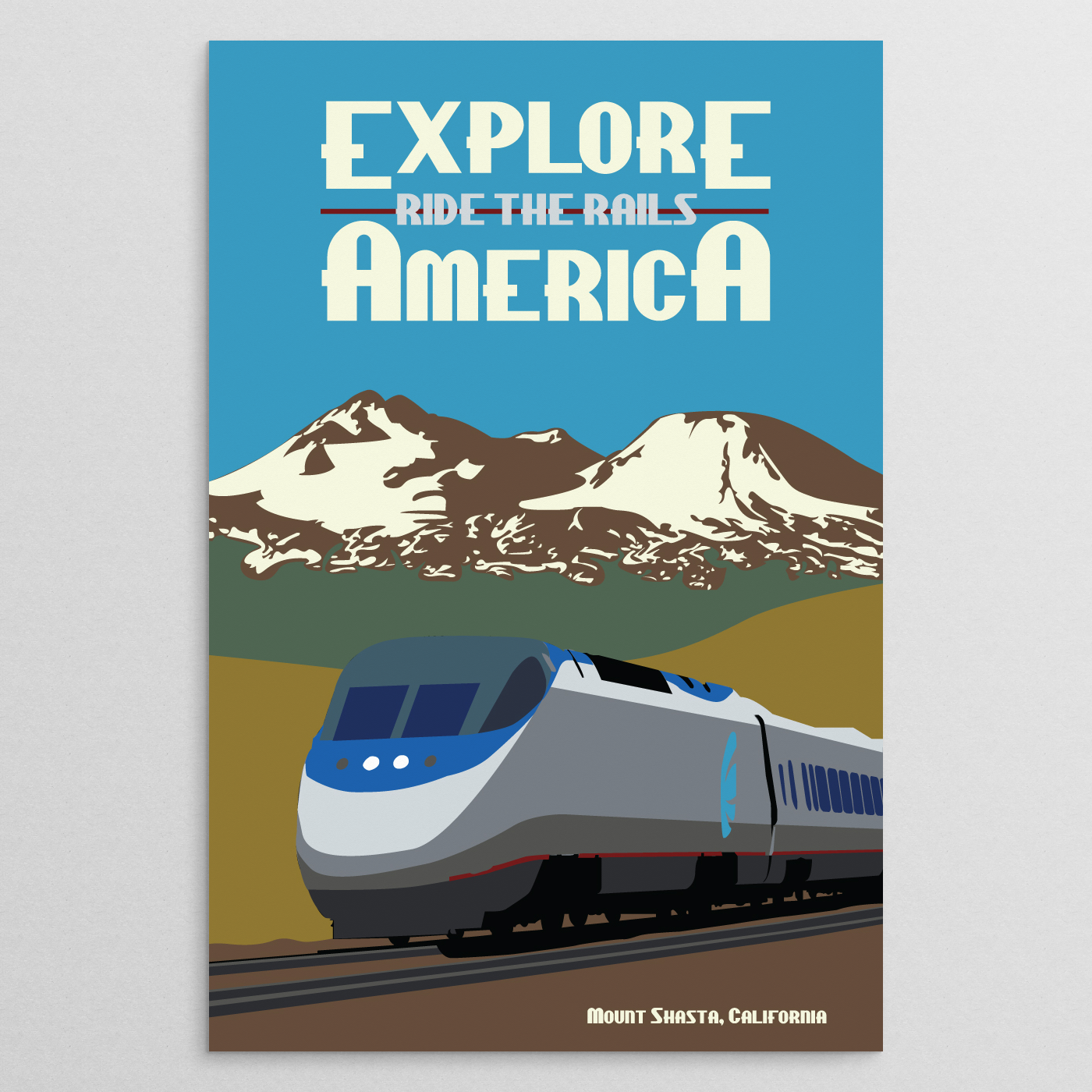
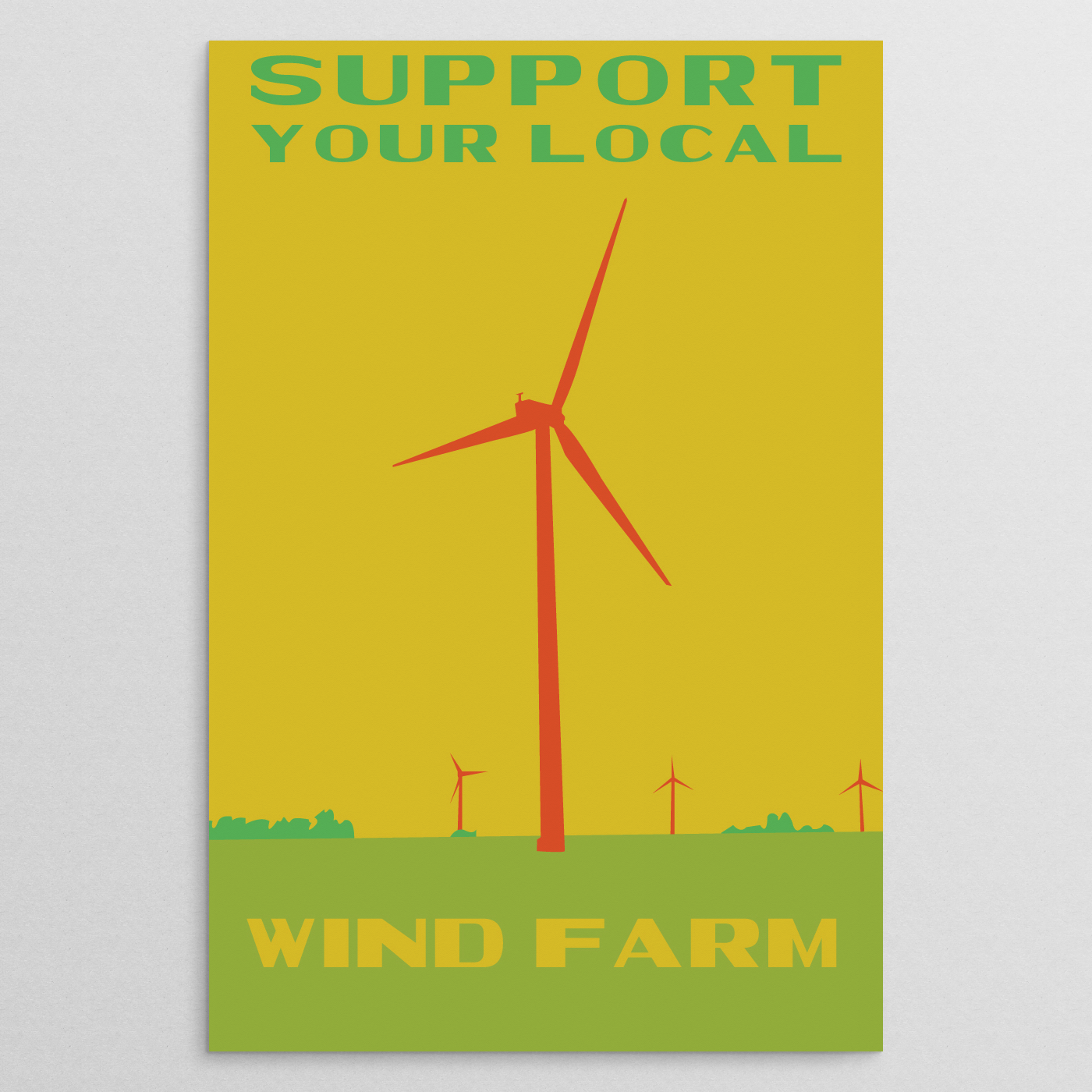
(top row) FDR FTW, Solar Garage, Ride the Rails, Wind Farm
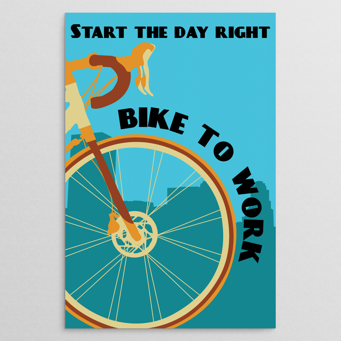
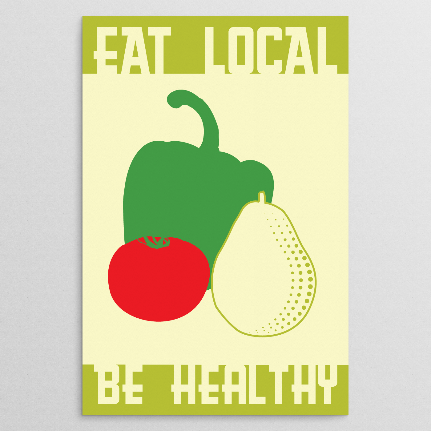
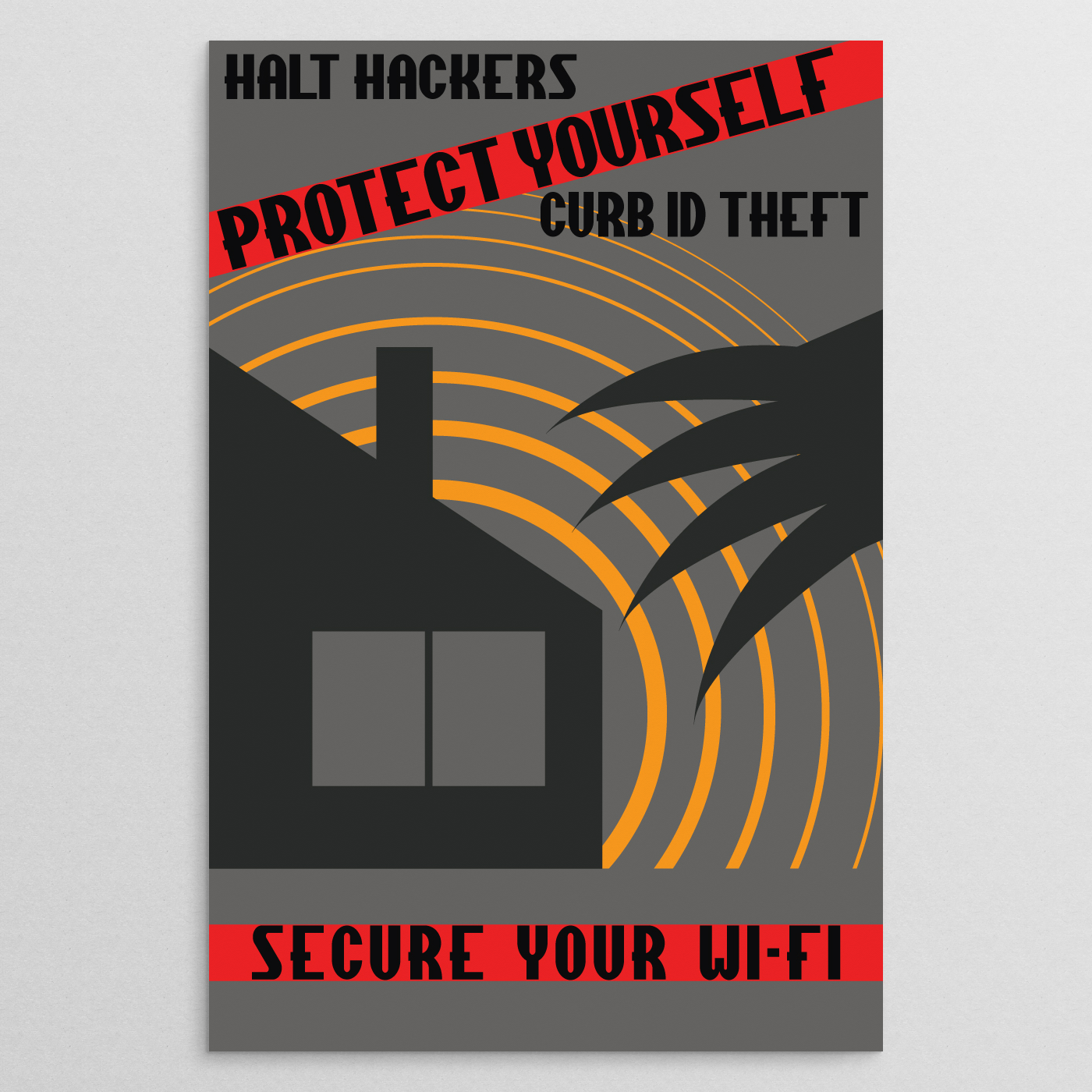
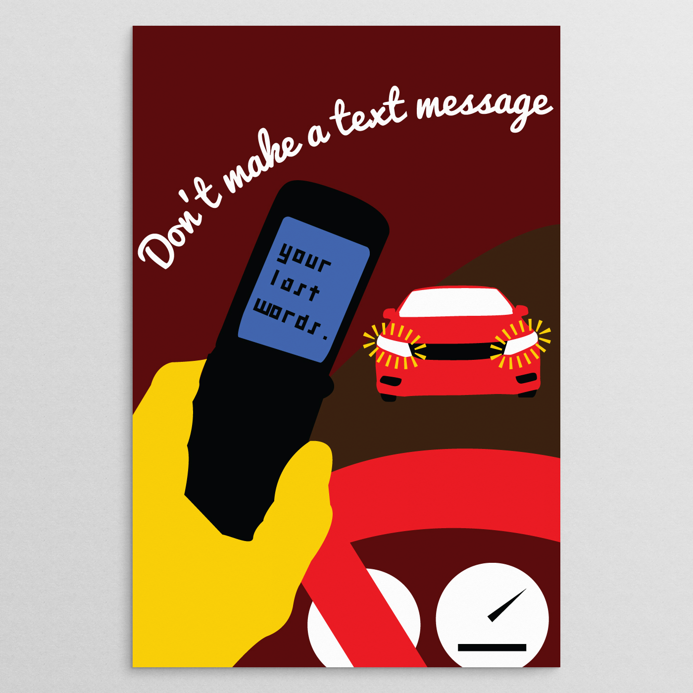
(bottom row) Change Gears, Eat Local Be Healthy, Secure Your Wi-FI, Last Words
With the exception of “Ride the Rails” and “Timeless", posters in Modern WPA followed an approach of using only a few colors. The reason for this not just for aesthetic value, but also to be possible to reproduce through different printmaking methods. For Example, “Solar Garage” was composed in such a way that not only could a simple ink jet print be made, but alcohol gel transfers and silkscreen prints can be made with ease from the choice of using only orange and black. Colors such as white or a background color like on “Eat Local Be Healthy” are not counted as they either represent or present themselves as the paper color.
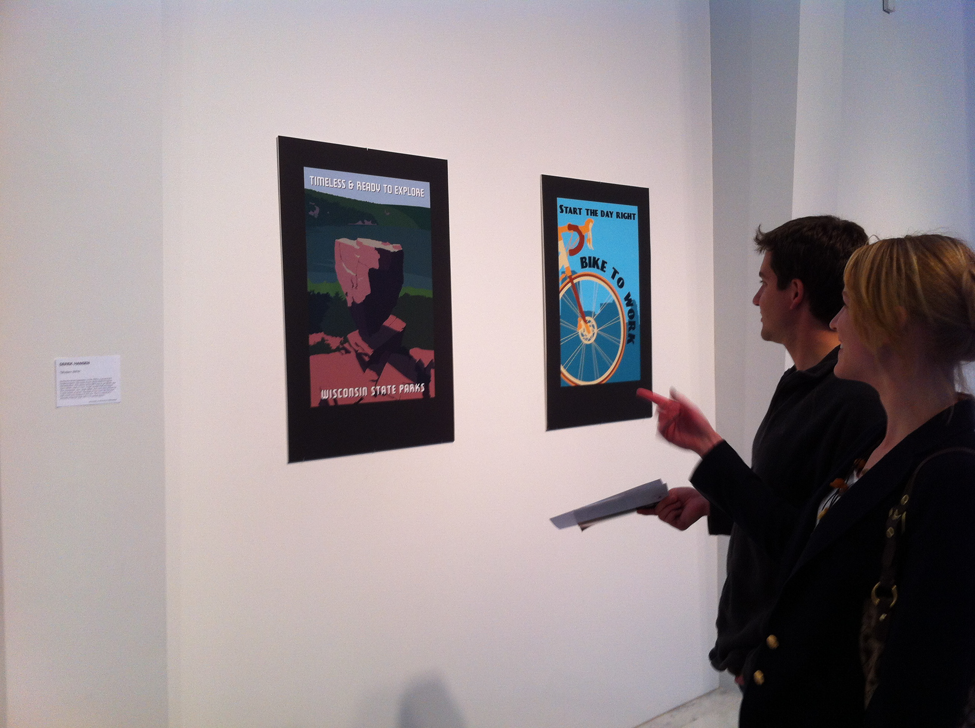
Posters selected for Modern WPA at MAM After Dark - April 20th 2012
For the showing in April at the Milwaukee Art Museum, a selection of prints from the December show would be presented. The three posters that were chosen were Solar Garage, Eat Local Be Healthy, and Change Gears. These three posters would then be presented with an all-new poster named Timeless. Patrons were able to identify with the project from the messages and simplicity of the themes.

Timeless
Throughout the months of research into the WPA Posters, one reoccurring subject that appeared was that of travel— specifically traveling to national parks and places of nature. With the project coming to a close, the last poster made should reflect something that viewers, specifically those in Wisconsin, can recognize and identify with. Timeless did that by illustrating a scene from Devil’s Lake State Park in Baraboo, Wisconsin. Those that attended MAM After Dark and saw the print enjoyed the simplicity of the style and message.
Modern WPA may have been the largest & most time-consuming project I have ever done. Regardless, it proved that posters to promote and convey messages of civic & public awareness have as much impact as they did then. The stylistic approach that was taken also proved successful by being simplistic and to the point. Which from observing the look and approach to WPA posters from the 1930s, took that very route to become a truly unique and American style.